Look: I am eager to learn stuff I don't know--which requires actively courting and posting smart disagreement.

But as you will understand, I don't like to post things that mischaracterize and are aimed to mislead.

-- Brad Delong

Copyright Notice

Everything that appears on this blog is the copyrighted property of somebody. Often, but not always, that somebody is me. For things that are not mine, I either have obtained permission, or claim fair use. Feel free to quote me, but attribute, please. My photos and poetry are dear to my heart, and may not be used without permission. Ditto, my other intellectual property, such as charts and graphs. I'm probably willing to share. Let's talk. Violators will be damned for all eternity to the circle of hell populated by Rosanne Barr, Mrs Miller [look her up], and trombonists who are unable play in tune. You cannot possibly imagine the agony. If you have a question, email me: jazzbumpa@gmail.com. I'll answer when I feel like it. Cheers!

Wednesday, March 28, 2012

Another Look at Wealth and Consumption - Pt 1

 Part 1 - Spending as a fraction of Net Worth

Tim Duy weighed in on the output gap debate - not my topic, but he presented this chart of net worth as a percentage of GDP.


Graph 1 Net worth as a Percentage of GDP 

That got me thinking again about the issue of whether consumption spending is determined by income or wealth. Specifically, if consumption is determined by wealth, there should be peaks in consumption corresponding to the dot-com and housing bubbles shown on Graph 1.  However, as Graph 2 shows, there were no such peaks.

Graph 2 Personal Consumption Expenditures


I've argued already that, contrary to standard economic thought, consumption is directly determined by income.  (Posted at RB and at AB.) One observation was that consumption, as a fraction of income, didn't vary much over time, averaging 90.1% with a standard deviation of 2.1%. 

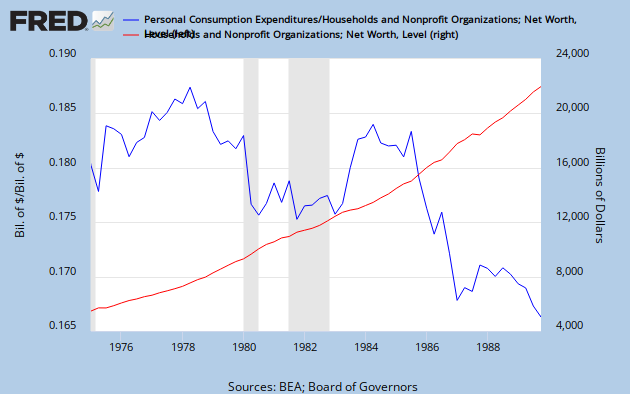
I took a similar look at consumption and net worth, data from Fred.  The next three graphs show personal consumption expenditures (PCE) as a decimal fraction of net worth (blue, left scale) along with net worth (NW) (red, right scale) over different time spans.


Graph 3A  Expenditures/Net Worth and Net worth, 1959-79,

Graph 3A spans from 1959 - the beginning of the data set - to 1979.  Net worth rises exponentially as the population grows.  Adjusting for population growth does not change the shape of the net worth curve, so, in the aggregate, we were becoming richer during those years.  Note that PCE/NW follows a generally similar, though far bumpier trajectory.  As I pointed out in the prior post, the personal savings rate also increased during this period, so the average worker was able to both save and spend more.


Graph 3B  Expenditures/Net Worth and Net worth, 1975-90

Graph 3B spans from 1975 to 1990.  Net worth continues on its exponential track.  But, after about 1979, PCE/NW drops, reversing the prior trend.  By 1990, PCE/NW is no greater than it was in the early 1960's.  Meanwhile, the personal savings rate also dropped - to a range below that of the early 60's.


Graph 3C  Expenditures/Net Worth and Net worth, 1989-2011

Graph 3C spans from 1989 through October, 2011.  The exponential growth of net worth falters before and during the two most recent recessions.  After about 1994, PCE/NW is a roller coaster ride.  Of particular interest is the exactly contrary motion at a detail level between NW and PCE/NW, after about 1998.  During the housing bubble of mid-last decade, PCE/NW hit an all time low.

What narrative makes sense of these three graphs?  Here's my attempt.

Through the 60's and 70's, the standard of living was increasing, as incomes and net worth rose together.  This allowed more discretionary spending, and therefore, the fraction of NW that was spent increased.

In the 80's, aggregate net worth continued to rise, but consumption spending, quite dramatically, failed to keep pace.  Lane Kenworthy has repeatedly pointed out that middle class income growth has decoupled from general economic growth as the upper income percentiles have captured an increasing slice of total income.  As the wealthy grew wealthier and the middle class fell behind, the fraction of NW that was spent declined - exactly the opposite of what should happen if increasing wealth determined spending.  But exactly what should happen if increased wealth is diverted to the already wealthy who have less of a propensity to consume.

During the 90's, growth in median family income and GDP per capita were close to parallel (see graph at the Kenworthy link)  so there was a lull in the decoupling.  For most of that decade, PCE/NW was close to constant at 0.18-.19.  But while spending was kept level, the personal savings rate continued to fall. 

During the current century, median family income has flat-lined, while GDP/Capita has continued to increase. The decoupling has resumed and the wealth disparity has widened.   During the two wealth bubbles, PCE/NW declined dramatically.  When the bubbles burst and net worth declined, PCE/NW increased  back into the 0.18-.19 range.  Most strikingly, from about 1998 on, the two lines in graph 3C exhibit exactly contrary motion at a detail level.

Conclusions:

There was a tight relationship between Net Worth and consumption through the 60's and the 70's, when earnings growth kept up with GDP and wealth disparity was slight by current standards.

This relationship broke down during the 80's - though one could argue as early as the mid 70's - as aggregate wealth and working class income decoupled.

Most recently, the relationship between NW and PCE/NW is inverse.  The big swings in NW that the bubbles provided also demonstrated that consumption spending does not depend on net worth.

As I indicated in the earlier post linked above, consumption spending does depend on disposable income, throughout the entire post war period.  A simple look at readily available data casts grave doubts on the idea that wealth, and not income, determines consumption spending.

UPDATE:   For the longer perspective, here is the data of Graphs 3 A-C on a single graph.


 Graph 4  Expenditures/Net Worth and Net worth, 1959-2011

In part 2, we'll look at how spending and Net Worth correlate.

Cross-Posted at Angry Bear.

Tuesday, March 27, 2012

Of Matresses and the Election

A clip from Fox?!?  what the hell is the matter with me?

Robert Prechter of EWI expounds on the title subjects - plus the difference between economic and financial markets.


Sunday, March 25, 2012

Sunday Music Blogging

My wife - she's a-love me!


Thursday, March 22, 2012

World Trade

Mark J. Perry reports on the latest world trade data from The CPB Netherlands Bureau for Economic Policy Analysis.  He presents a graph from 2000 on showing that the levels of world trade and world industrial output have both reached new post-recovery highs.

He takes this to be very good news, and draws some broad conclusions.

Bottom Line: Both world trade volume and world industrial output reached fresh record monthly high levels in January. Trade and output are now far above their pre-recession levels, providing evidence that the global economy has made a complete recovery from the 2008-2009 recession. For the U.S., the annual growth rates for exports (10%) and industrial output (3.5%) reflect the underlying strength in America's manufacturing sector.

The graph tells me rather a different story.  I went to the source, got the raw data back to 1991, and made my own graph.


It's true that there has been a V-shaped recovery from the staggering decline that occurred during the 2008 financial crisis.  It's also true that there is a new post-recovery high.  But I tend to look at graphs of time series data in terms of trends, and have decorated the graph accordingly.

The green straight line is a lower trend line boundary, approximately connecting all the dips.  The yellow straight line is an upper trend line boundary, connecting the tops.  The purple line is an exponential best fit through the peaks, indicated with purple dots.  Of course, in a finite universe, an exponential trend must eventually end.  Even a straight line expanding envelope probably can't go on forever. 

Now, it looks as if there might be a new top limit to growth.  The red line connects the top just before the crash with the new top that Mr. Perry finds so exciting.   If this holds, then going forward the data will be contained in a collapsing envelope.

Here's a close up view of the crash and recovery.  I've added some purple lines connecting detail level peaks during the recovery.


The purple lines appear to be approaching the red line as an asymptote.  Alternatively, the metric these points represent might be rolling over and approaching another decline.  Either way, there is a clear loss of momentum as the recovery ages. 

I don't have a crystal ball, and  I'm not going to make a prediction about the future of world trade. But it's clear that the historical trends no longer apply, and I do not share Mr. Perry's optimism.

Update:  Cross-posted at Angry Bear.

Sunday, March 18, 2012

Sunday Music Blogging

A truly outstanding performance of this show-stopper by a high school cast.

I played for this show my senior year in H.S. - 48 years ago.  I see now that you miss a lot from the orchestra pit.

Granddaughter Rebekka has a part in the play right now, and a nice little feature in this number.

There is no set choreography for pieces like this.  It's all up to the creativity and ability of the local talent.


"Show-stopper" is used advisedly.  When I linked the vid on Facebook, one of my friends commented, "This is one of those 'mandatory' song-and-dance numbers that adds nothing to the story line."  This is true.  But I feel that musical theater isn't just about story line - the stories tend to be on the weak side anyway.  It's about a balance among story, song, and dance - and in the case of the Music Man, lots of particularly snappy and clever dialog.


And when he dances, certainly boys, what else - the piper pays him! 
Yes, sir.  
Yes, sir. 
Yes, sir.


Friday, March 16, 2012

WTH?!? Friday - Drink Up

Some old drinks and their prohibition-era substitutes. H/T to Sharon

Thursday, March 15, 2012

Jobless Claims Remain at Four Year Low

Steve Benen at Maddowblog reports:

The number of Americans who filed requests for jobless benefits fell by 14,000 last week to 351,000, matching a four-year low, the U.S. Labor Department said Thursday. Claims from two weeks ago were revised up to 365,000 from 362,000. Economists surveyed by MarketWatch had projected claims would fall to a seasonally adjusted 355,000 in the week ended March 10. The average of new claims over the past four weeks, meanwhile, was unchanged at 355,750.

In terms of metrics, keep in mind, when these jobless claims fall below the 400,000 threshold, it's considered evidence of an improving jobs landscape. When the number drops below 370,000, it suggests jobs are actually being created rather quickly.

We've now dropped below 370,000 for six consecutive weeks, and seven of the last nine weeks.


The stimulus, of course, has been a huge failure.

Quote of the Day - Pt 2

If the federal government were run more like here in Mississippi, the whole country would be a lot better off.
------ Willard "Mitt" Romney

You can't make up shit like this.

Donna Ladd, Editor in Chief of the Jackson Free Press reacts:

Say what, Gov. Romney?! 

See, we JFP folks cover the state government, and we watch it very closely up here in the capital city. How can we say this nicely? It's a bona fide mess. We were so astounded that four of our staffers launched a round of Twitter satire using hashtag #runitlikeMississippi to make the point that this state is no model for running anything, much less the federal government (see page 7 for our favorites).

We love this city, and state, and want it to succeed. It is home for many of us, and some of our staff came here precisely because it's such an interesting place to live and work (and so much journalism left undone). We appreciate our state despite its shortcomings, and we work every day to try to make it better.


But to say--even while pandering for votes--that our state is a model of governance is flabbergasting and insulting to our citizens.

Romney isn't a stupid man, but in some ways he's just as dumb as a rock.  More importantly, he has no program, no character, and no ethical position on any issue.   Fundamentally, he has no respect for any living human being - including himself.

What a tragically flawed imposter.  It's no wonder most Rethugs can't stand him.

H/T to Rachel Maddow on Facebook.

Quote of the Day

I'll believe corporations are people when Mitt Romney goes to prison for murder.
-----   Venwodb

Monday, March 12, 2012

Qoute of the day

From Karl Smith.

There is no point to using reason if you have already decided what you believe.

This goes pretty much hand-in-hand with my idea that the vast majority of people arrive at their political positions with no regard for facts, data, logic, or any other aspect of reality. 

Post hoc reasoning is just confirming the bias, and that - contra Karl - is the point.

Sunday, March 11, 2012

Sunday Music Blogging

Brandi Carlile and the twins at the Mt. Baker Theater, Bellingham, WA. March 19, 2010.


If you have come to expect anything from my Sunday Music offerings, it would certainly not be this.

I'll admit that I never heard of Brandi Carlile or this song until it was featured in this NPR All Things Considered spot.

Then, it became pretty special.


Enjoy.

Friday, March 9, 2012

Recovery Continues at a Ho-Hum Pace

The economy added 227,000 jobs in February.  The overall unemployment rate stayed at 8.3%.

As good news goes, this is pretty weak, but at least it isn't bad news.

This number would have been only average during the Clinton administration, when times were good.  The numbers ought to be much better than that during a recovery.  But we don't have recoveries any more.  This number is not a lot more than what it takes to keep up with population growth.

So, yeah, the economy is growing.  But it's not growing fast enough to do a lot of good, especially when every nickle of income growth goes to the top 50% of the population.

Here's the chart, for the private sector only, from Maddowblog.  OK news.  Nothing exciting.


Wednesday, March 7, 2012

Has America Lost It's Drive? - Pt. 4

In Part 3 of this series, (at RB, at AB) I wondered a couple of things. 

- With the vehicle/1000 people number in the range of 825 to 845 since 2004, is the market near saturation?
-  Is the January sales number of 14.2 SAAR (seasonally adjusted at annual rate) enough to maintain the vehicle/1000 people number?

For the first question, I have to again credit Roger Chittum for pointing me to this 2007 paper, Vehicle Ownership and Income Growth, Worldwide: 1960-2030, by Dargay, Gately and Sommer (32 page pdf, data through 2002.)  There's a lot to this paper, including projections into the future for vehicle sales and fuel consumption, worldwide.   My immediate interest is in their use of a Gompertz function to estimate vehicle market saturation as a function of per-capita income.

Here is one of their graphs.

 Graph 1  Vehicle/1000 Gompertz Function of Per-Capita Income

Their model indicates flattening above about $30K per year, and leads to a saturation point in the U.S. of about 852 vehicles per 1000 population.  Saturation points for various countries also depend on urbanization and population density.  See the paper for details and background.

This indicates that the U.S market is about 97% saturated, give or take a point.

What does that suggest for vehicle sales going forward?   Karl Smith led off the month pointing to this graph from Calculated Risk, estimating light vehicle SAAR for February at 15.1 million.  With that, on to question 2.
 
I already have the data in hand for vehicles/1000 population (see part 3.)  The data for the Calculated Risk SAAR graph comes from BEA, Table 7.2.5S.  Plotting a scattergram of YoY change in Vehicles/1000 population vs annual average SAAR for the years 1990 to 2009 gives us this picture.  (See notes, below.)


 Graph 2   SAAR and Change in Vehicles/1000 Population

This suggests that the break even point for vehicles per 1000 is right around 14.7 million annual average SAAR.

The official vehicle/1000 numbers are only available up to 2009.  But we have the SAAR data for 2010 and 2011.  Annual average SAAR for 2010 is 11.77; for 2011, it's 13.05.  You probably don't want to take the values suggested by Graph 2 too literally, but seeing the vehicle/1000 number slip to around 815 for 2011 should be a reasonable expectation.  This is still slightly above the 95% saturation level.

Average light vehicle SAAR for the first two months of this year is 14.65 - right at the break even point for vehicles/1000 population.  

 Notes on Graph 2

The red dots represent data for 2001 and 2002.  The SAAR values look reasonable.  The changes in vehicles per 1000/population do not.  An increase of 25 in one year, from 800 to 825, followed by a decrease of 10 in the following year with SAAR, nearly identical (17.46 and 17.15) makes no sense.  An average of the two, plotted for both years as yellow dots, by some odd coincidence, lies exactly on the best fit line.

The R^2 value of .43 is less than stellar, but not terrible.

Eliminating the two questionable points raises R^2 to a respectable .65.

Cross Posted at Angry Bear.